Lazy vinyl
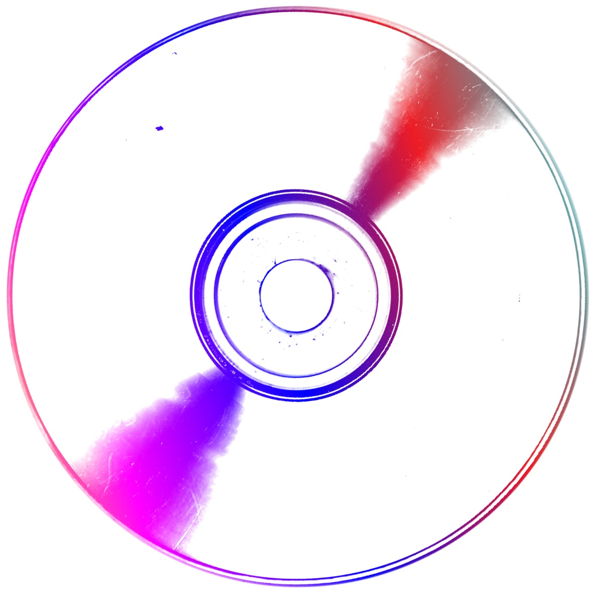
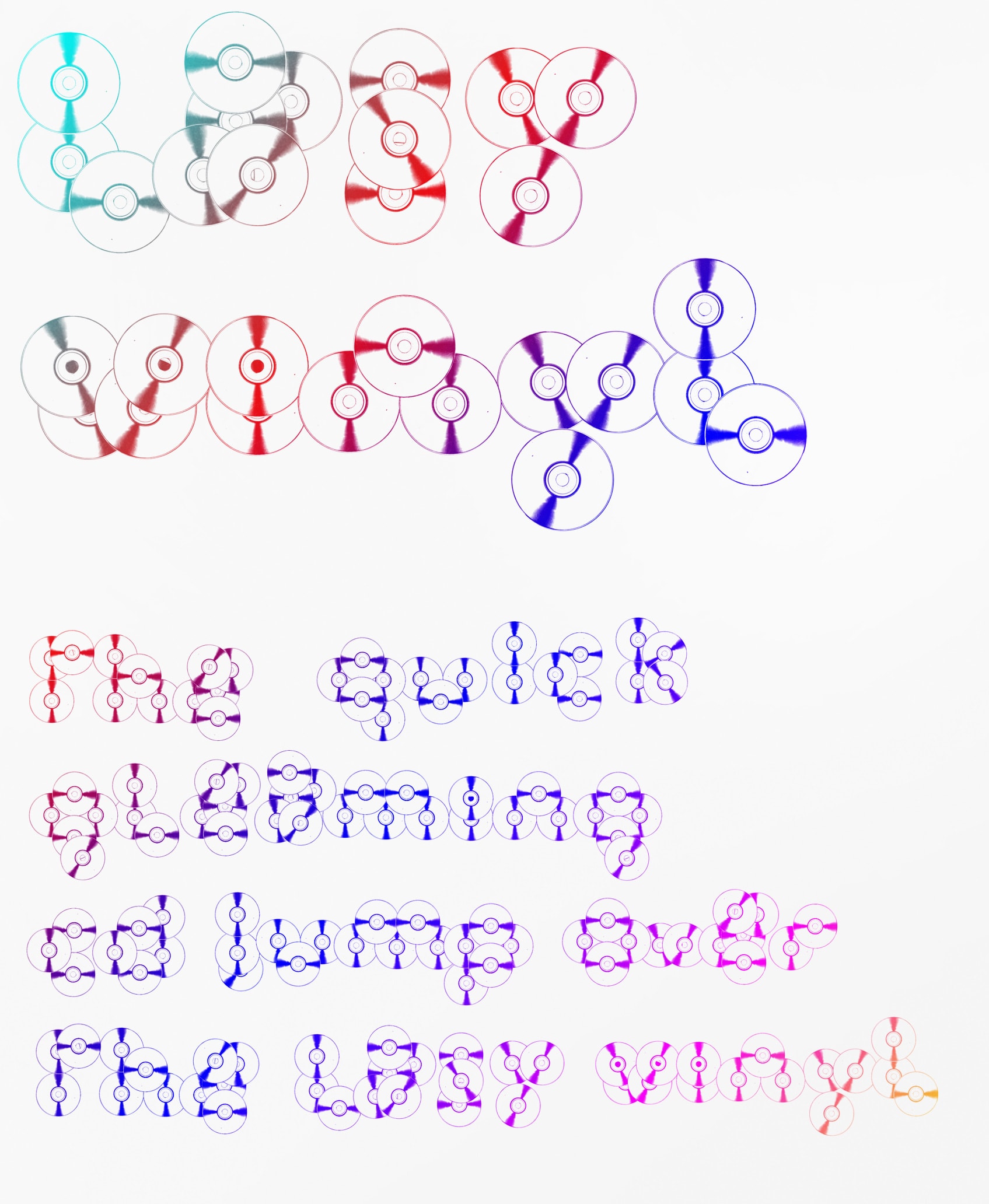
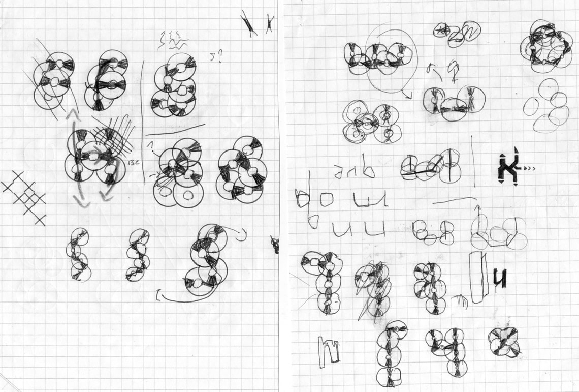
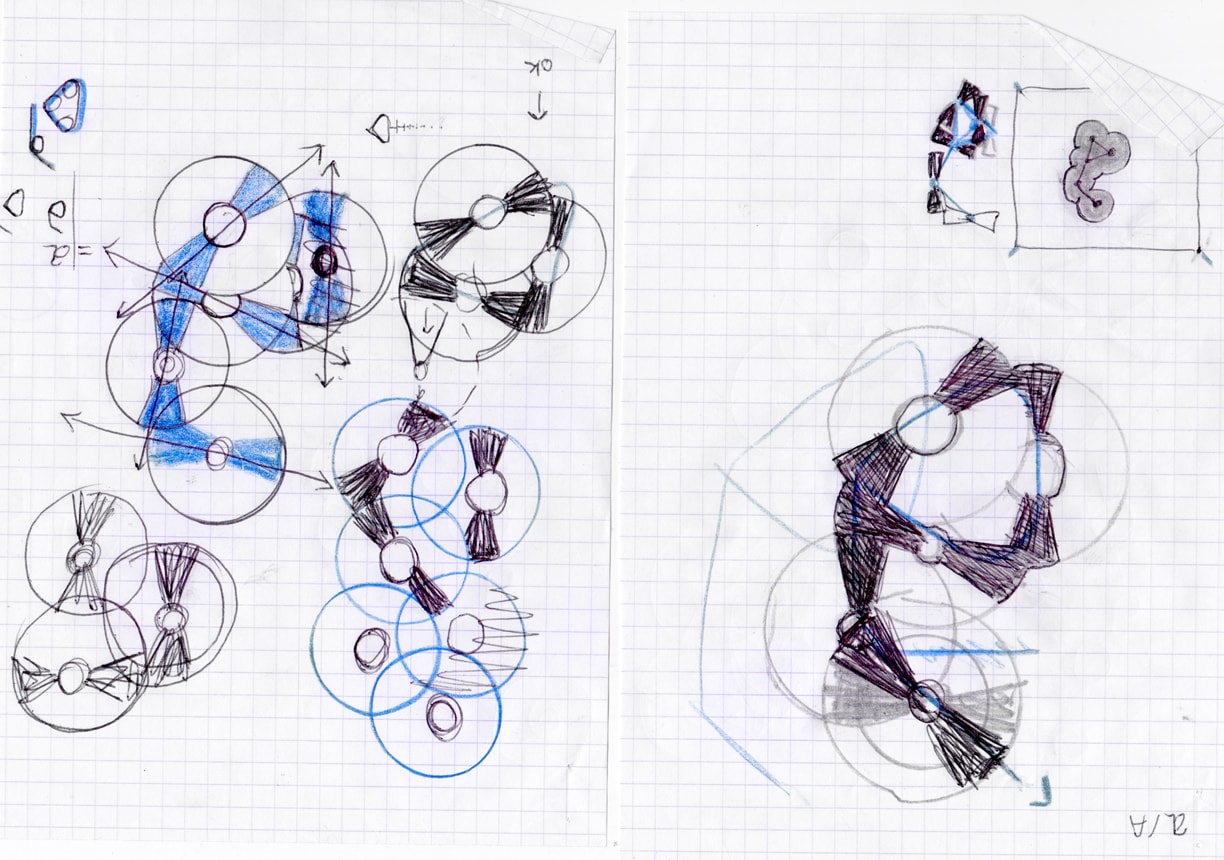
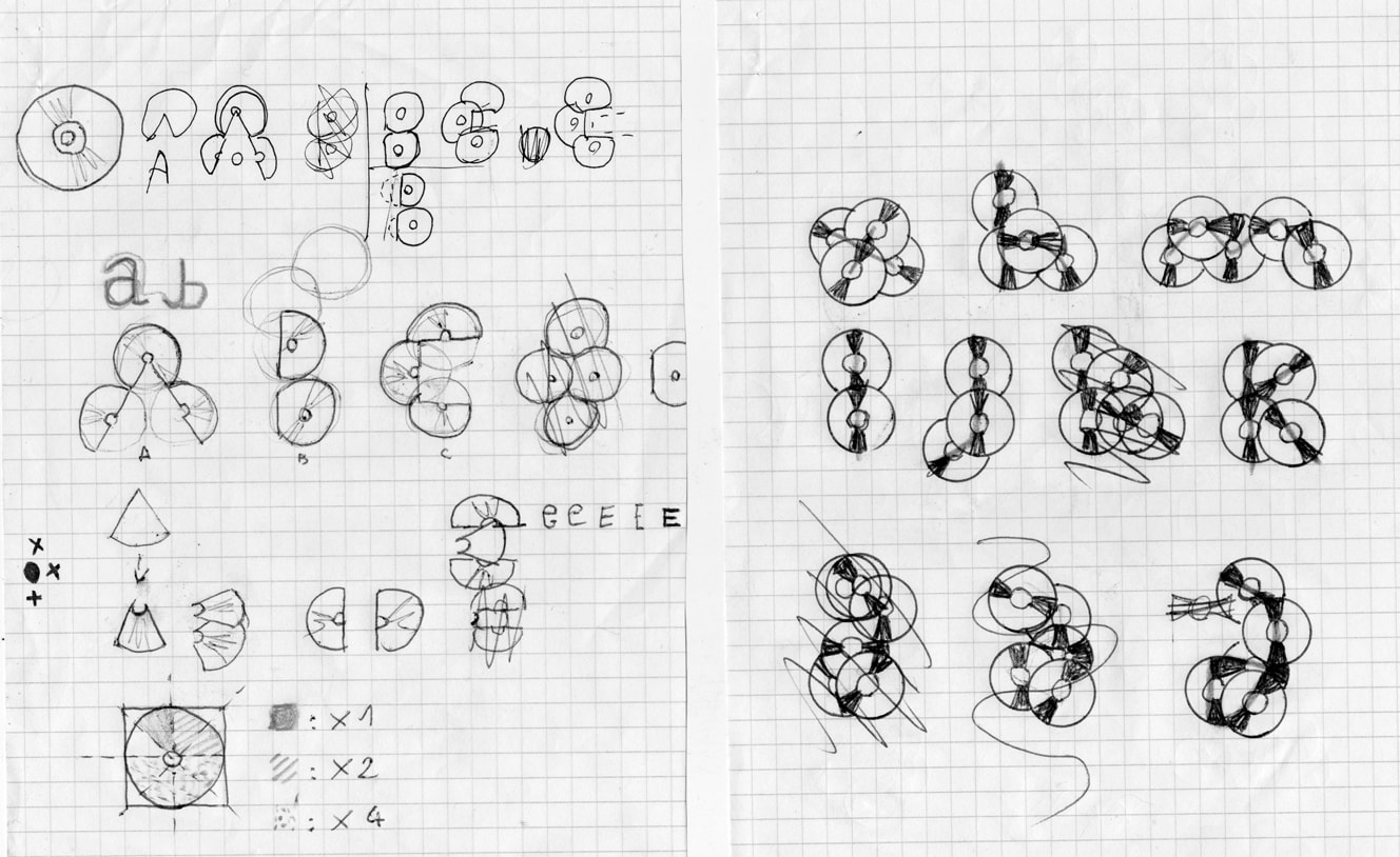
2011Experimental typography based on the shape and reflections of a CD-ROM. It is designed only for titling, or for very specific applications. The reading is deliberately disrupted by the complex patterns superposition. The eye must find poins of deciphering in the reflections by ignoring circles. The reading is little more easily obtainable from a distance or by doing a blink of an eye. The police have major ornamental properties, and require the full concentration of people who want to read it.